GeneLab’s latest software release includes a new visualization portal to interact with gene expression data from space-related omics experiments. The enhanced portal includes a new search interface, new plots and layout, and advanced settings to customize the plots.
The tools in this latest version include:
- Gene Expression query table
- This table provides the normalized gene expression values for microarray datasets and normalized count values for RNA-seq datasets for each sample in the dataset.
- Pair plot
- This plot allows a user to compare overall gene expression data between to two samples from that dataset.
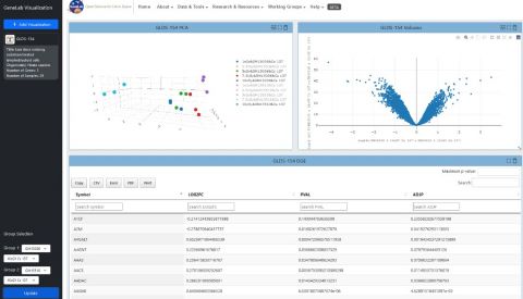
- Volcano plot
- This is a scatter plot that compares the significance (i.e. p-values) vs the log fold-change values for the genes. This plot allows for a quick view of the most significantly regulated genes for each dataset.
- Heatmap
- This is a graphical representation of the individual samples displaying how the overall genes are up- and down-regulated across all samples in the dataset. Clustering of both the genes and the samples are also displayed.
Click here to access the portal. More visualizations coming soon!
This release also includes updates to the GeneLab Open API wrapper and an interactive user interface to parse metadata and data. The API wrapper was developed by Kirill Grigorev. To query the GeneLab database, click here.