On November 15, 2019, NASA’s GeneLab delivers its latest software release of the only spaceflight-relevant omics database in the world, adding to its already large, annotated database, the ability to analyze omics data and visualize already processed data. GeneLab is forging the way to Life Science Space Data democratization, making interpretation of complex omics easier and thus facilitating the GeneLab community to generate new hypotheses more quickly and accurately.
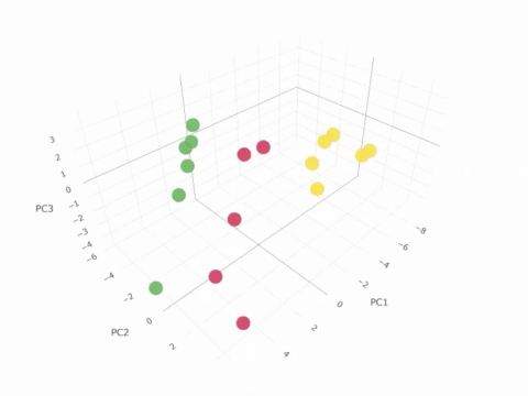
Example of an interactive Principle Component Analysis (PCA) plot of GLDS-25
In addition to being a database, GeneLab is a scientific data analysis and collaboration platform aimed at expanding scientists’ access to omics data and to better explore the molecular response of terrestrial biology to spaceflight environments with its new visualization capabilities. This publicly available platform also includes a new look and feel to further extend the capabilities of the GeneLab Data System (GLDS). The GLDS Version 4.0 release adds several new features:
- new user interface for repository study pages with collapsible panels and left pane navigation
- downloadable dataset citation data in repository pages
- multi-file management actions in GLDS curation tool
- new visualization platform
In addition to the newest software release, GeneLab’s Visualization Working Group (VWG), which includes members from our scientific community, assisted in the development of the new visualization platform as a collaboration. The visualization capabilities were developed in two components. The first component provides a basic visualization platform on GeneLab and will be hosted on the project’s servers. This allows for creative and useful interactive visualization tools for investigators to easily analyze spaceflight omics’ datasets and provide answers to space biology related questions. The basic visualization currently consists of two components:
- The Gene Comparison Analysis Tool (GCAT), developed by Catharinus Dijkstra. This tool set includes:
- Gene Expression query table
- This table provides the normalized gene expression values for microarray datasets and normalized count values for RNA-seq datasets for each sample in the dataset.
- Pair plot
- This plot allows a user to compare overall gene expression data between to two samples from that dataset.
- Volcano plot
- This is a scatter plot that compares the significance (i.e. p-values) vs the log fold-change values for the genes. This plot allows for a quick view of the most significantly regulated genes for each dataset.
- Dendrogram
- This is a tree diagram showing how the individual genes and samples will cluster together.
- Gene Expression query table
- The second component of the basic visualization is the S plot and Heatmap tool that were developed by DAMVAD Analytics, Jess Alfredsen and Sebastian Steensson.
- The S plot allows a user to determine how the genes in each dataset are impacting overall pathways. This interactive plot allows a user to adjust both significance and fold-change values to show which pathways are potentially being impacted for the dataset.
- The Heatmap is a graphical representation of the individual samples displaying how the overall genes are up- and down-regulated across all samples in the dataset. Clustering of both the genes and the samples are also displayed.
These tools use an API wrapper developed by Kirill Grigorev to request the data from the GeneLab Repository. The transcriptomics data has been processed by the GeneLab team using standard analysis pipelines vetted by the Analysis Working Groups (AWG).
Check out the studies in GeneLab with Visualization: Studies with Visualization
- Click on the desired GLDS # and click on “Visualization” in the left menu.
In the near future, additional basic visualization components will be added and will further enhance GeneLab’s visualization capabilities.